
With the Academy Awards recently announcing nominees, we got in a movie state-of-mind and asked our graphic designers to weigh in on their favorite movie posters.
The movie poster: old as Hollywood itself, it’s usually the first glimpse you get of an upcoming release and it can go a long way in creating buzz and curiosity for the upcoming film, setting the tone, and establishing elements of a visual identity.
And now, the envelope please, here are The Ohlmann Group designers commenting on what makes a perfect movie poster for them.
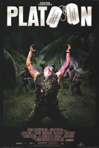 Image credit: Orion Pictures
Jason — Platoon — A lot of movie posters play into the genre of the film, visually and design-wise. With Platoon, it’s all about that central figure. Even though we can’t see the face, it immediately conveys the emotion, and that’s what really sold it for me. Plus, with the logo treatment up top with the dog tags, it lets you know what kind of movie it is.
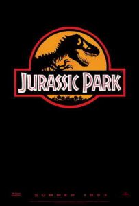 Image credit: Amblin Entertainment
Andy — Jurassic Park — This poster says everything it needs to say in a less-is-more way. You totally understand what it is because it’s a super strong mark. It’s striking. Sort of along the same lines as Ghostbusters, a simple logo says it all.
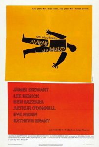 Image credit: Columbia Pictures
Melina — Anatomy of a Murder — I’m really kind of biased because of Saul Bass and his influence throughout my creative learning. I like the flat graphics, even though they aren’t really smooth shapes. I’m really into vector shapes, which work really well with motion graphics. The poster is very simple and very bright.
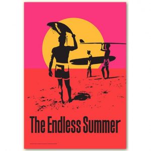 Image credit: Monterey Media
Gary Hinsche — The Endless Summer — It’s an iconic design, and it’s absolutely collectible. I also like how John Van Hamersveld was big time into conservation and into founding nonprofits to save the beaches. (Editor’s note: our very own Mr. Hinsche actually knows poster creator John Van Hamersveld. For a really cool article on the legendary poster, click here for a Vanity Fair piece explaining its history).
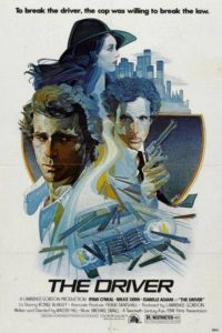 Image credit: EMI Films
Meghen — The Driver — When I think of a movie poster, I think of something I want to hang on my wall. The Driver has those collage-y type elements, but they all work together to make one centralized piece. It utilizes the space well, plus it looks manageable to recreate and like it would be fun to replicate. And the colors are great.
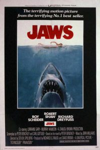 Image credit: Universal Pictures
Gary Haschart — Jaws — I remember tracing this poster as a kid. It was simple, clean, and powerful. You have the red type signifying blood, the large teeth… and like everybody else, I was scared to go swimming. Visually, it’s centered, and it really drew your eye to what was going to happen next.
Tune in next time as the OG graphic designers weigh in on another design topic!
