
The Winter Olympics are underway, and the best of the best are competing in all sorts of thrilling events as the whole world watches. The designers at The Ohlmann Group scrolled back through the years to look at previous Winter Olympics logos to choose their favorites.
Here are the medal winners for us.

Image credit: International Olympic Committee
Andy — Salt Lake 2002 — I like this one because it incorporates so many things about Utah, but at the same time it’s so simple. Within the snowflake shape, you’ve got snow on top of the mountains. Plus the colors just say Utah. It’s a nice clean mark.
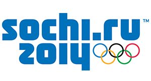
Image credit: International Olympic Committee
Meghen — Sochi 2014 — For this one, I like the cleanliness of it and the type’s mirror image effect. I also like the space it takes up. I like how the weight of the typeface works, with it being heavy on one side and lighter on the other side with the rings. It works really well.
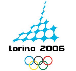
Image credit: International Olympic Committee
Jason — Torino 2006 — This one is very clean and can be very legible at a smaller size. I like how the circles in the design mimic the Olympic rings, and the overall mark has a nice line of motion to it. (Honorable mention: St. Moritz 1928.
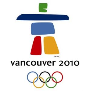
Image credit: International Olympic Committee
Melina — Vancouver 2010 — I like the Vancouver one because it reminds me of Saul Bass. It’s really creative, and I like how it looks like a person. Plus the different weights of it work well.
