What’s in a color? It depends on who you ask! Each year, Pantone releases its pick for “color of the year,” which is meant to be an indicator of where color trends will lead us in the coming year.
But what do these color trends mean to marketers? Let’s find out!
How Color Affects Us
This year, Pantone chose “Viva Magenta,” a bold shade in the red family, as the color of the year. Pantone describes it as “an animated red that revels in pure joy.”
If you’re thinking that description sounds dramatic, think again. Color can certainly evoke emotion. Color psychology is the study of how different colors affect both our mood and the way we behave. So yes, the colors we choose as marketers are extremely important because our brand colors spark emotional reactions in those who see them.
Viva Magenta All Around Us
In order to understand how Viva Magenta affects our emotions, we wanted to see it in action. We asked our team here at The Ohlmann Group to capture life’s “viva” moments, shared below. The resulting images reveal a tone that’s versatile and powerful – spotted in nature, in art, in our work, and in our everyday surroundings.
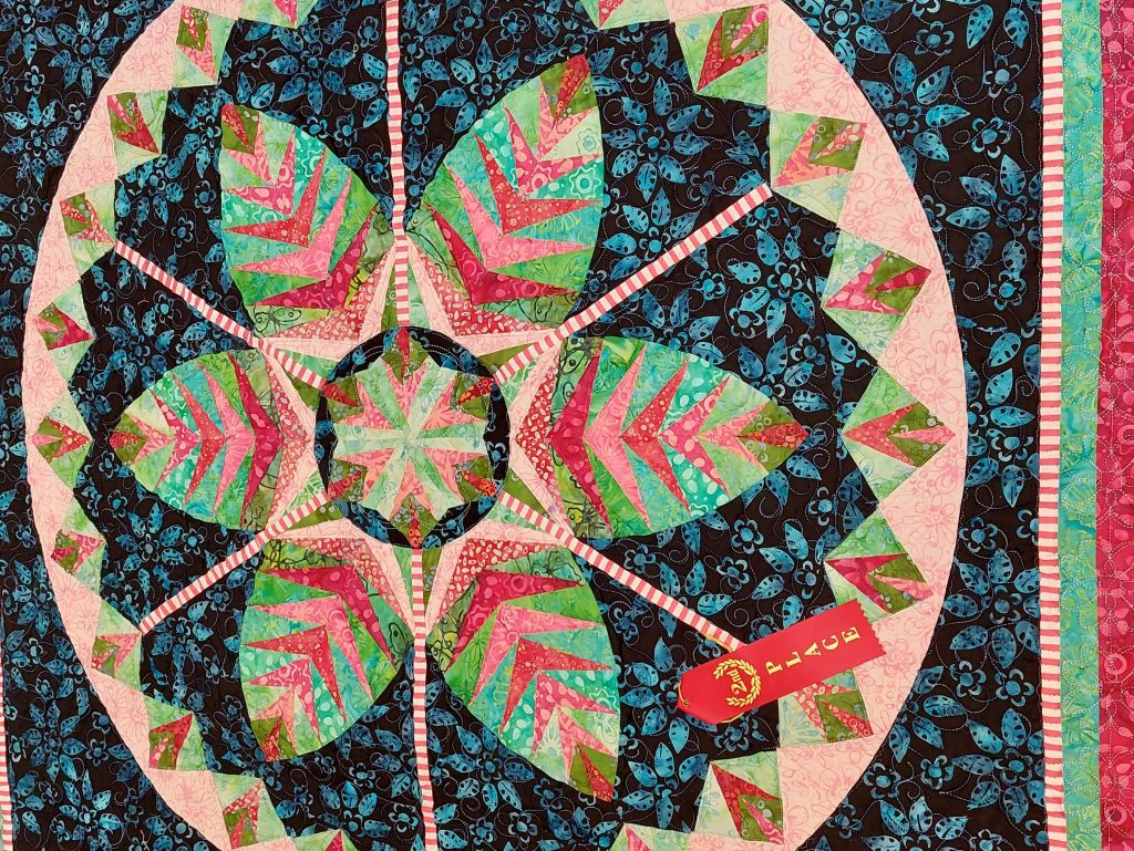
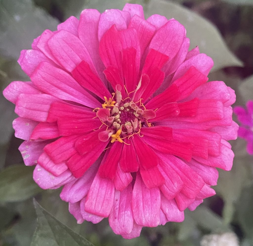

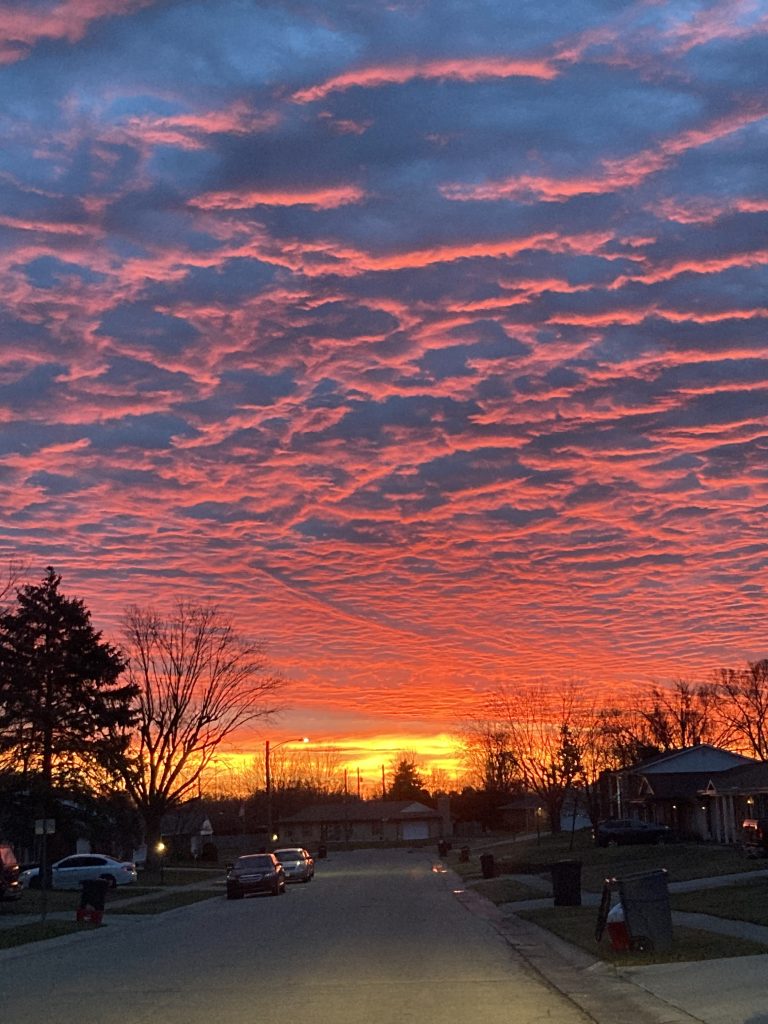
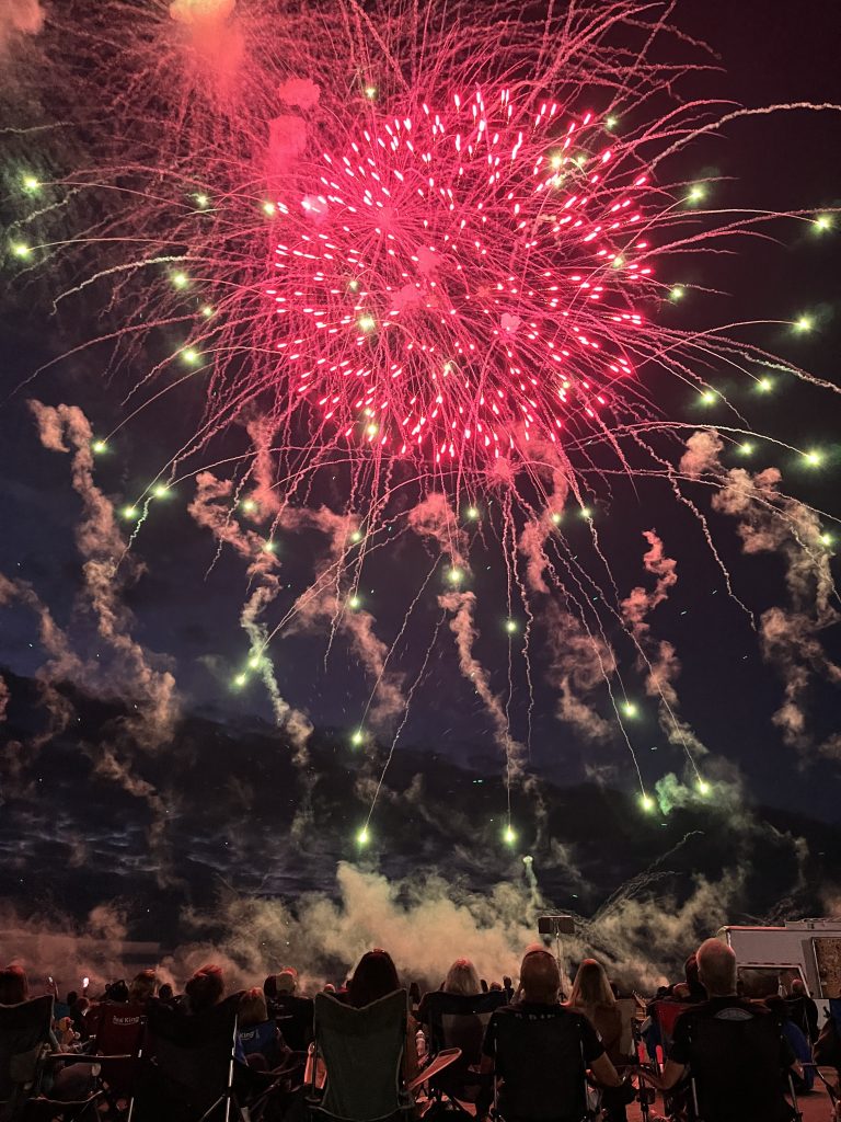
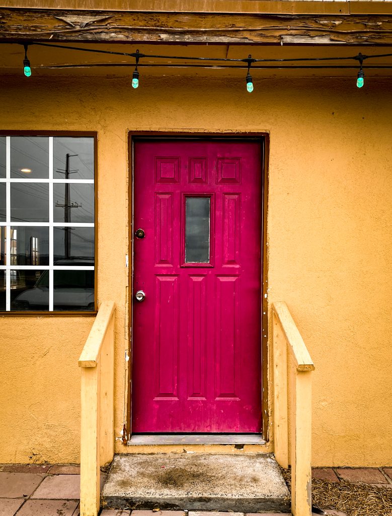
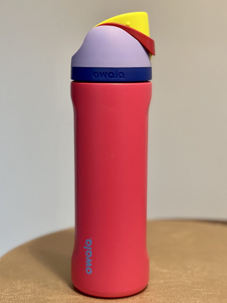
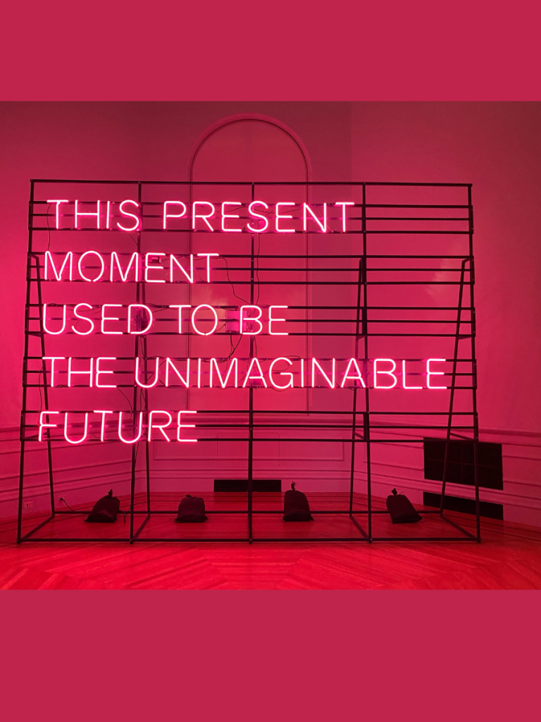
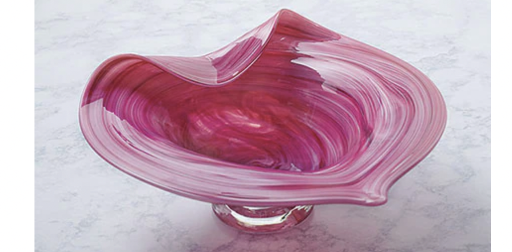
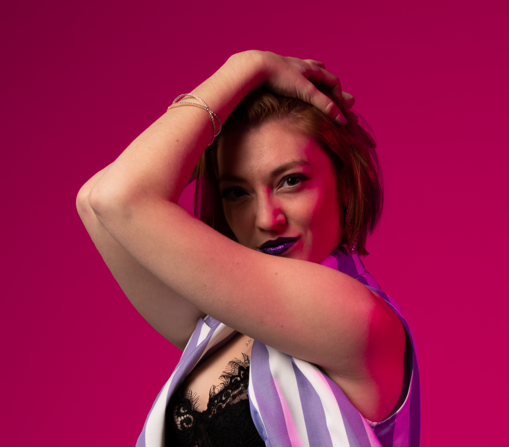
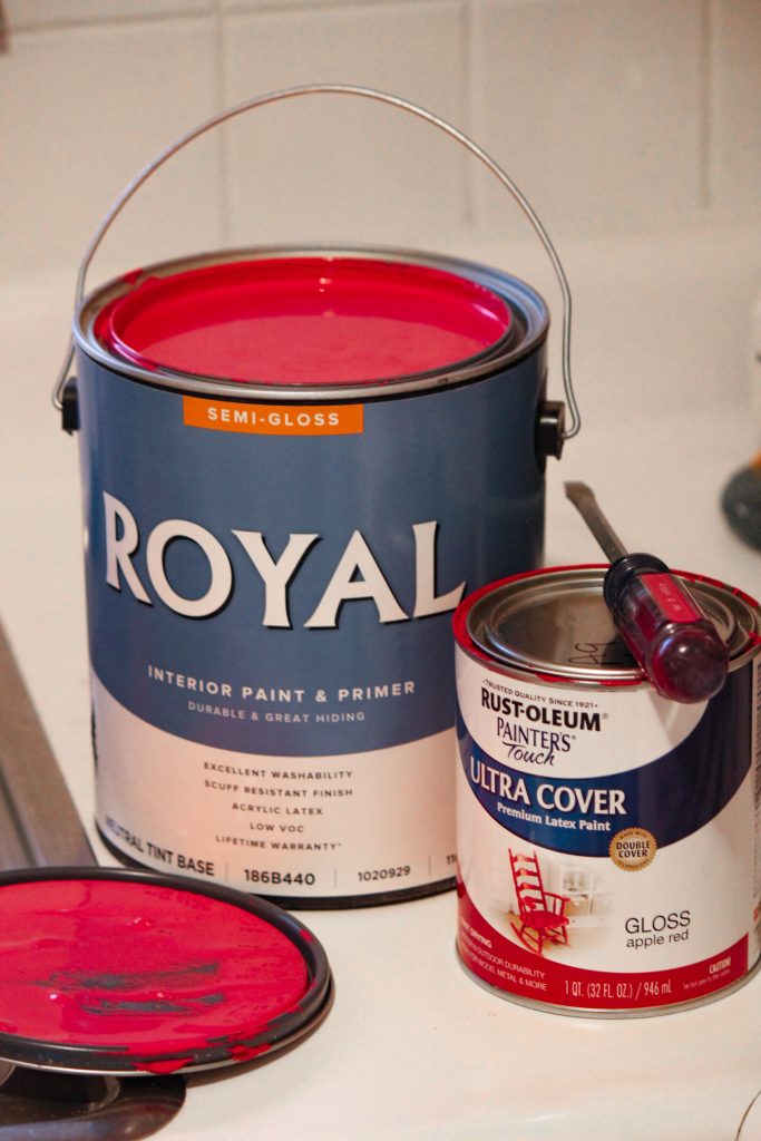
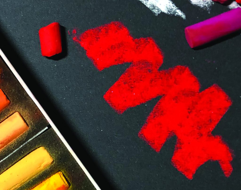
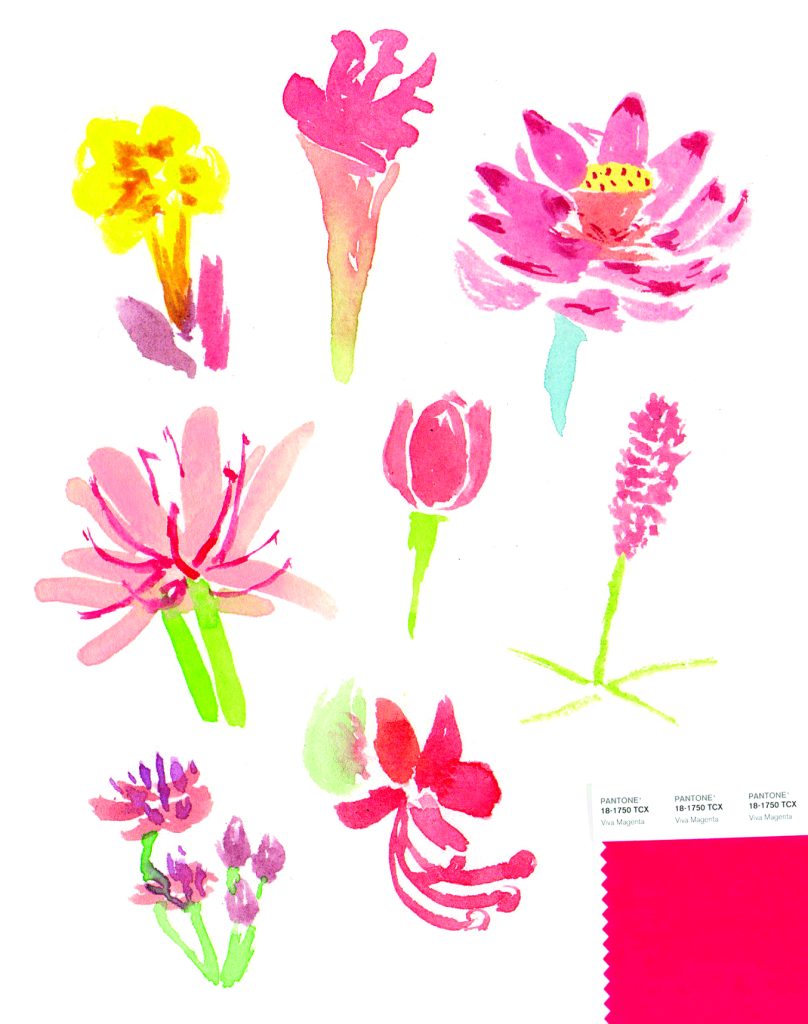
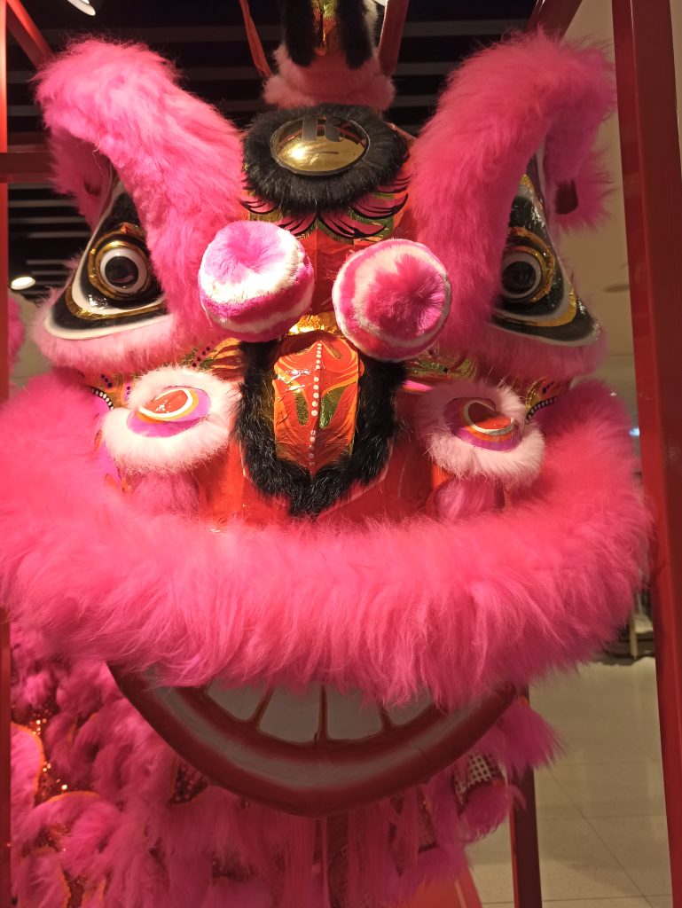
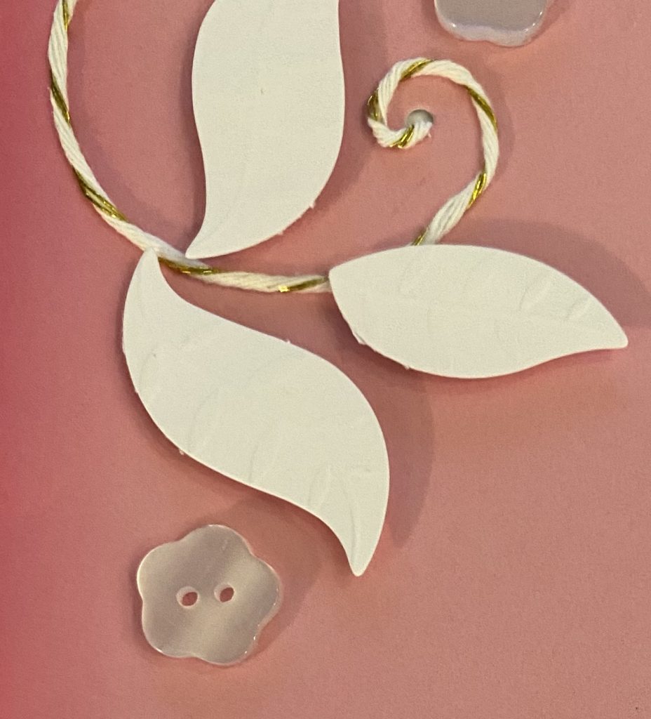
No one knows color better than designers, so I asked our Ohlmann Group design experts what they thought when they first caught a glimpse of Viva Magenta. Senior Art Director Andy Kittles described it as “bold, energetic, vibrant, playful, and striking.” Meanwhile, Ohlmann Group Senior Art Director Jason Hart was thinking about how he could work it into his wardrobe. Touché, Jason.
Where We Predict Viva Magenta Will “Pop”
Viva Magenta will certainly shake things up this year, but in what industries? Does Viva Magenta have a place in marketing design?
“It has a lot of ‘pop’ and warm energy. For a brand looking to evoke that lively feeling, Viva Magenta would be a good accent color, either with a contrasting dark, neutral palette or combined with other equally vibrant colors in a limited palette,” said designer Meghen Murphy.
However, Murphy believes trendy hues might be better suited to interior design projects. “I say take it with a grain of salt. If you’re drawn to it naturally, run with it, but don’t try to force it into things you do for the sake of following a trend,” she said.
Ohlmann Group motion designer Cody Rayn agrees. “I think a lot of people are bored to tears over the recent beige, gray, and overall minimal color palettes that have saturated everything – especially interior design. That’s where I see this thriving the most,” he said.
Marketing Design Beyond the Trends
Unlike fashion and interior design, when it comes to marketing, color choice is less simplistic – thanks mostly to color psychology. Whether you’re creating a brand mark or marketing collateral, the design experts at The Ohlmann Group recommend putting in strategic thought that transcends color trends.
“Color trends are good overall barometers to be aware of, but when marketing, there are always more specific considerations. What is the competition doing, and how will you stand out from the masses? What emotions or ideas do certain colors evoke in your given field? What’s the least expected execution, and is there something to tap into there?” said Hart.
Want more expertise from the creative minds at The Ohlmann Group? We’re here to help! Subscribe to our newsletter below for more great marketing insights, and reach out to our team today to start the conversation.

